Projects
About
Resume
Contact
NADIA CORTEZ
Projects
About
Resume
Contact
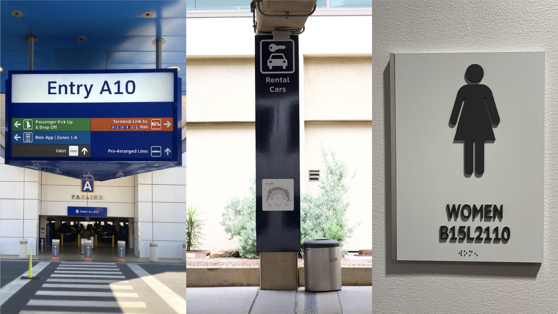
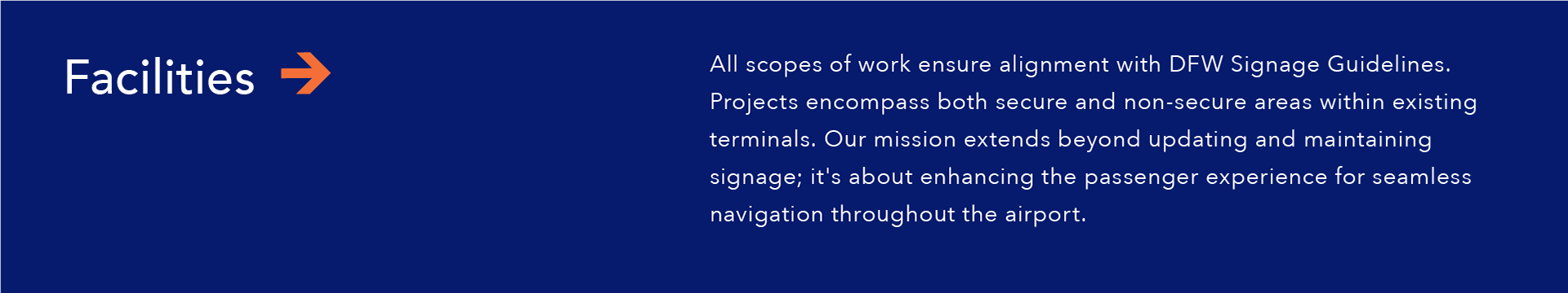
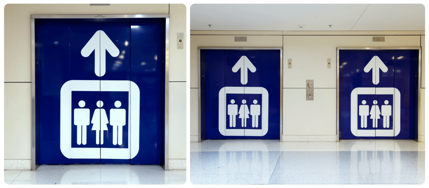
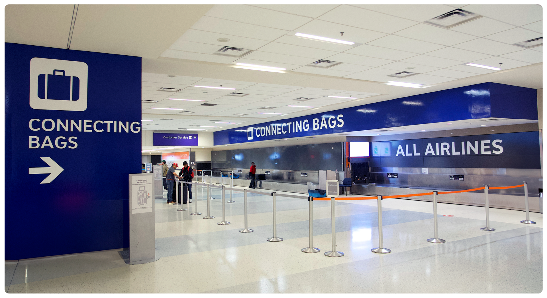
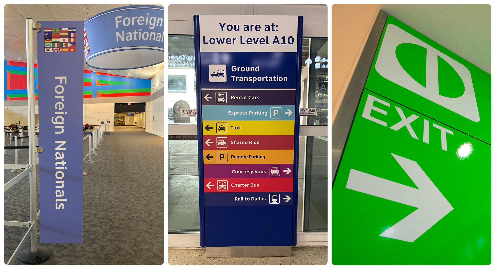
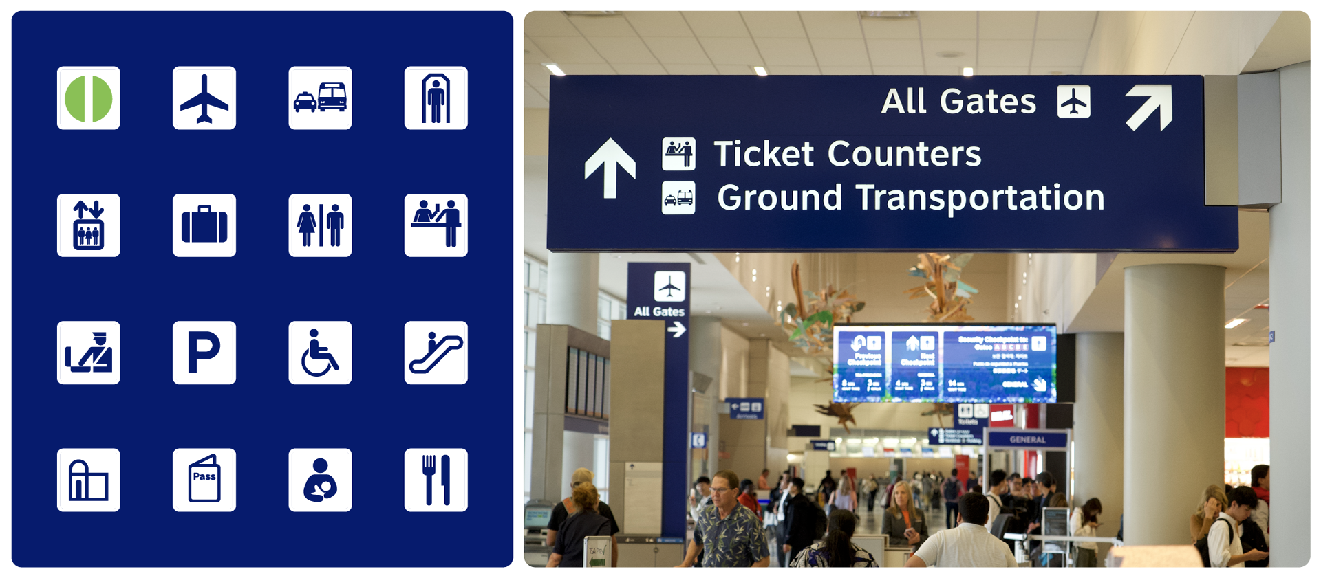
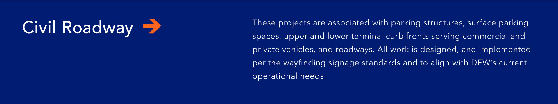
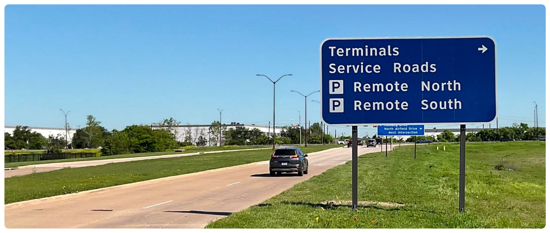
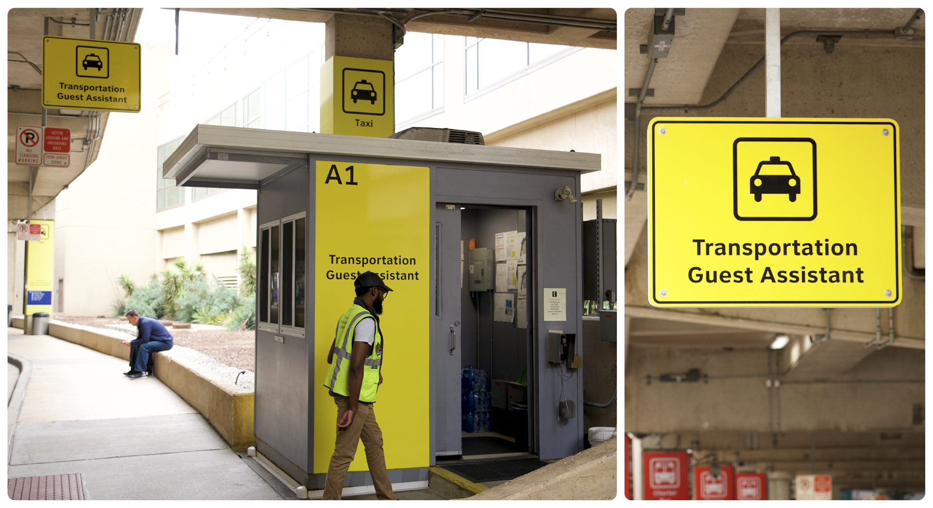
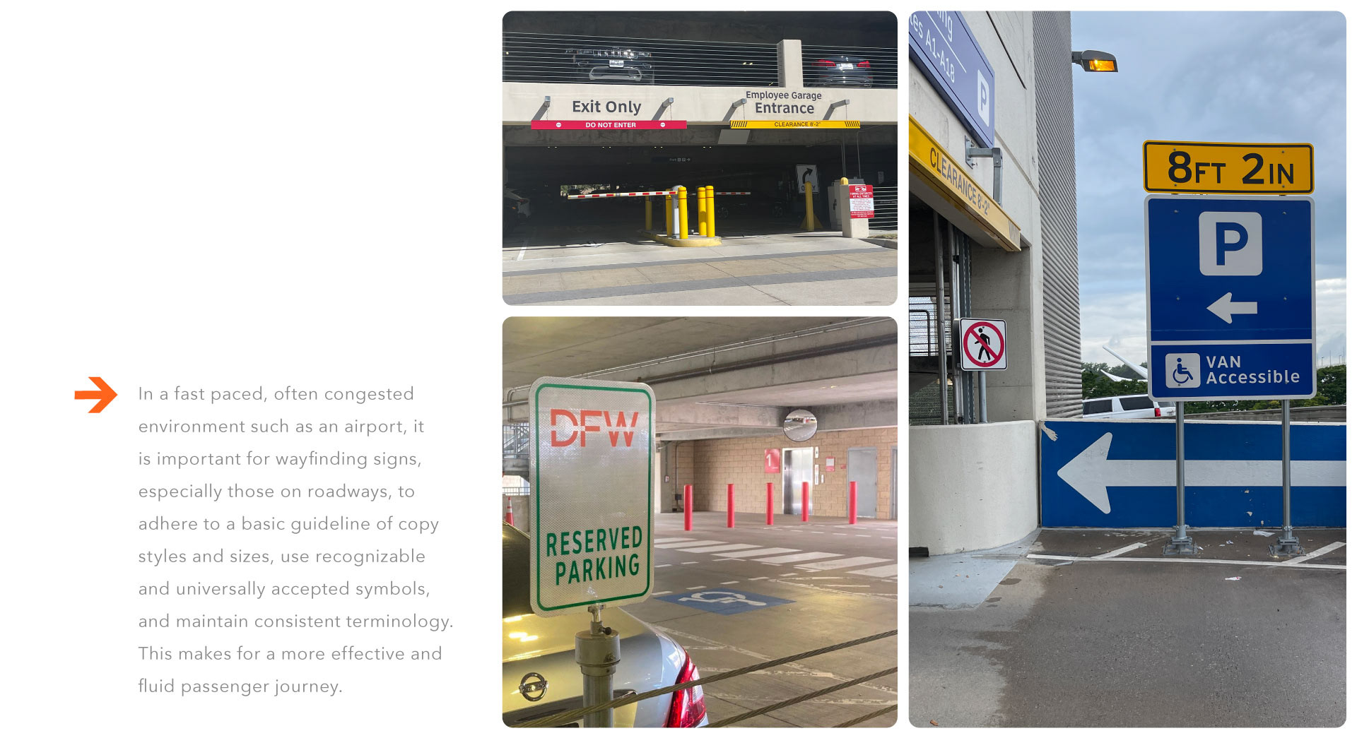
DFW International Airport
See More >>>
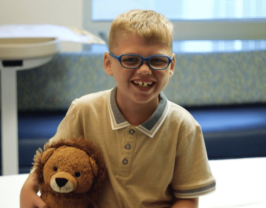
Children's Health | Brantley's Roar
Toy Maven
Dallas Police Department
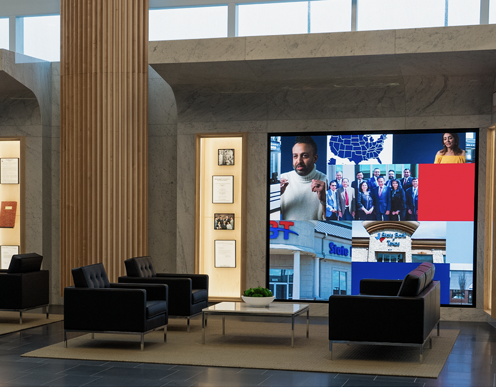
State Bank of Texas
KERA Broadcasting
Parkland Hospital | Our Team is Here for Your Team
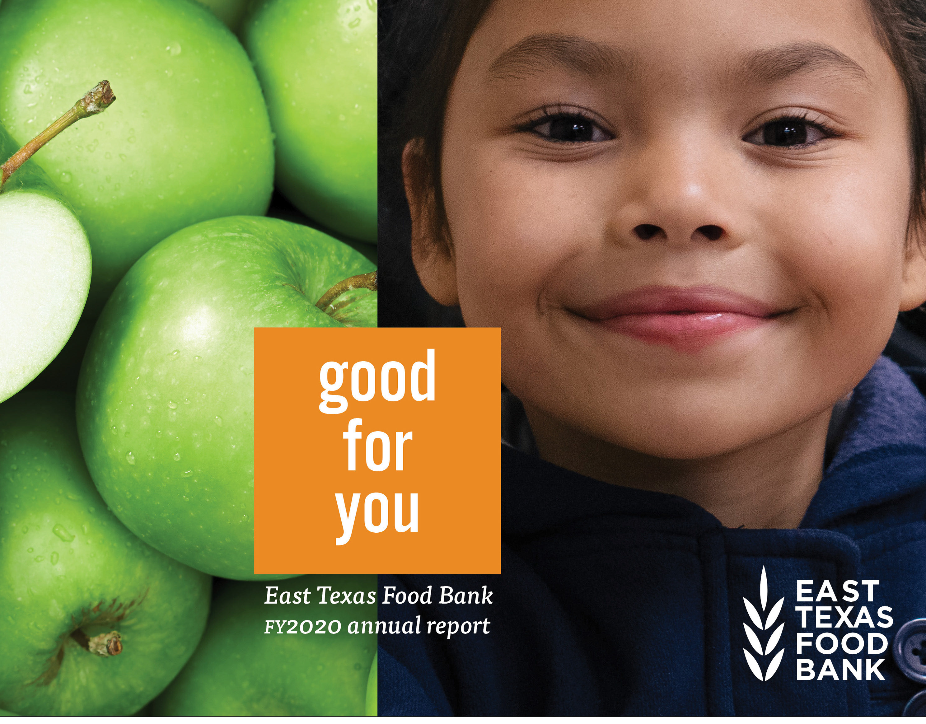
East Texas Food Bank
Southern Methodist University
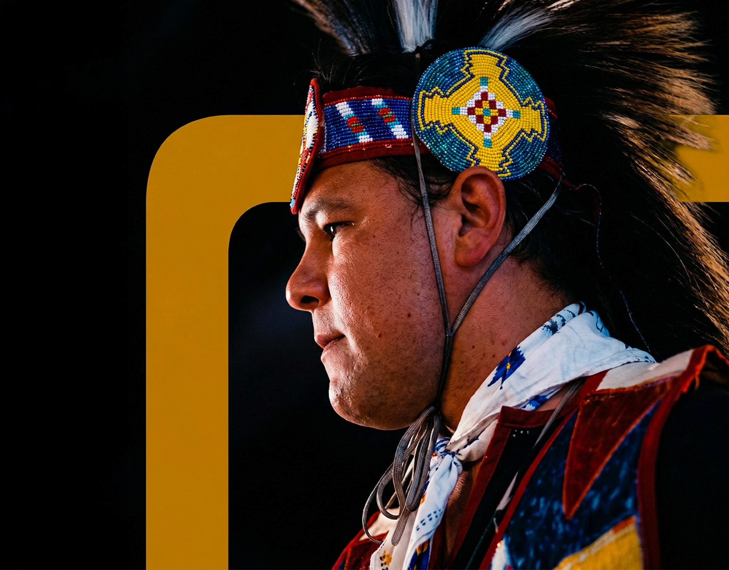
Texas Native Health | 988 Campaign
AAF Dallas | 2024 Addy Awards Show Opener
↑
Back to Top